We deleted our onboarding and retention went up
generalOur onboarding was five steps with a progress bar. 71 percent of people finished it. Of those, 12 percent ever came back.
So the onboarding worked perfectly and the product didn't. Here's the mistake underneath it, which is a statistical one and which I'd bet is sitting in your onboarding too.
Every step was justified by a correlation
Connect your calendar was there because accounts with a connected calendar retained better. I'd checked. It was true in the data.
Invite a teammate was there because accounts with two or more users retained better. Also true.
Both were backwards, and you can show exactly how backwards with a model where the thing I was forcing does literally nothing.
A cohort where the calendar has zero effect
Take a thousand signups. Say 300 of them have the problem badly and 700 are curious. The serious ones stick around 60 percent of the time, the curious ones 5 percent.
Now the only other assumption. Serious people connect a calendar 80 percent of the time, curious people 20 percent. Not because it helps them. Because that's what somebody with a real workflow does.
The calendar changes nobody's retention in this model. It has no causal effect at all. Here's what my dashboard would have shown me anyway:
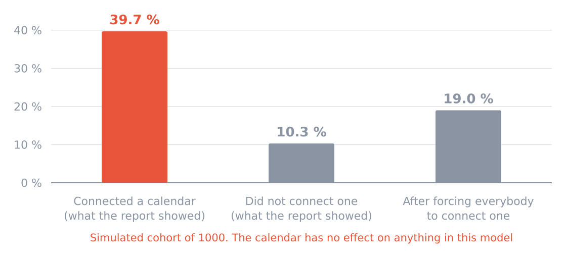
Third bar is what happens if you force everybody. That is the number I was chasing.
| Group | People | Retained | Rate |
|---|---|---|---|
| Connected a calendar | 380 | 151 | 39.7 percent |
| Did not connect one | 620 | 64 | 10.3 percent |
Nearly four times better retention, from a variable that does nothing.
That number is not a coincidence or a subtle bias. It's just what you get when a hidden trait drives both behaviours. And it's exactly the kind of gap that makes a founder say the data is unambiguous.
Now force everybody through the step
This is the part that finished the argument for me.
Make all the curious ones connect a calendar too. Retention in the connected group falls from 39.7 percent to 19 percent, because you've filled it with people who were never going to stay. Overall retention across the thousand doesn't move at all. It's 21.5 percent before and after, because nobody turned into a customer.
You have made the metric worse while changing nothing about the business. And if you were watching the connected group as your success measure, you'd conclude the onboarding got worse, panic, and redesign it.
The test that takes one minute
Take the sentence users who do X retain better, and try it in reverse. Users who intend to stay tend to do X.
If the reverse sounds just as true, X is a symptom. Forcing it will do nothing except add a step, and adding steps has a real cost even when it has no benefit.
Run that on your own onboarding checklist. In my experience most of it fails, including in products much larger than mine, because the checklist was assembled from exactly the correlations that fail this test.
The thing that showed me
I sat behind one customer while she used it. She reached step three, invite a teammate, and typed in a colleague she didn't actually want to invite, because she wanted past the screen. She told me afterwards she'd assumed she couldn't use the tool alone.
She was our ideal user. She nearly bounced because my onboarding implied she needed a team.
And here's how bad that is. The invite counted as a successful step. It pushed my activation number up. It also sent an email to a stranger, under her name, about a product she'd used for ninety seconds, and my dashboard filed the whole thing as a win.
I'd been watching that number climb for months and reading it as progress. What it measured was how effectively I could pressure people into clicking, and I'd been optimising it hard.
What we did instead
Deleted all five steps. New users land in a workspace with three example items already in it, clearly marked as examples, and one button saying do this with your own data.
Week four retention went from 12 percent to 31.
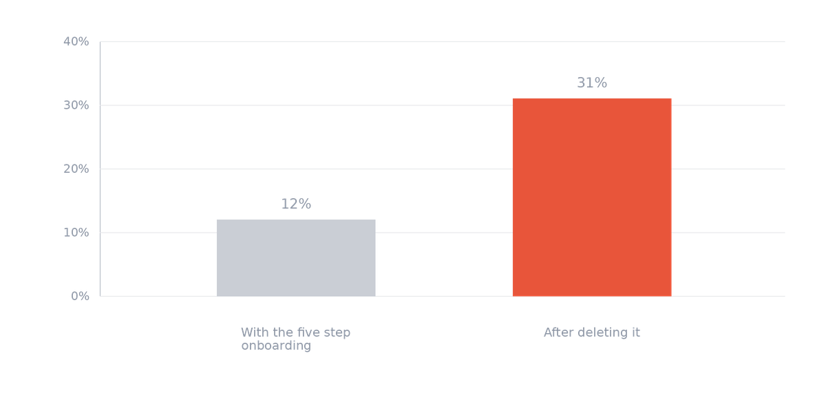
Share of new users still active in week four.
The deletion is the part that sounds bold and it isn't the part that worked. We tried an empty workspace first, for ten days, and it was worse than the checklist. Nine percent, below where we started. People landed on nothing and left.
What works is landing inside something that's already working, so the product demonstrates itself rather than describing itself. The three examples are the three shapes of use we see most, each a couple of clicks from being useful with real data.
| Version | Week four retention |
|---|---|
| Five step checklist | 12 percent |
| Empty workspace | 9 percent |
| Three marked examples | 31 percent |
If we'd only tested the first two we'd have concluded the checklist was helping and put it back. It was helping, compared to nothing. That's a much weaker claim than the one I'd been making.
Marking them as examples isn't optional, by the way. Our first version didn't, and two people thought their account had been set up with somebody else's data in it, which is a very bad ninety seconds for a tool that touches money.
The metric that replaced activation
Share of new accounts that process their own file in the first session. It was 19 percent when I started measuring and it's 44 now.
The point isn't that 44 is lower than 71. It's that there's no way to score well on it without the product having actually done something useful, with that person's data, in the first ten minutes.
A metric you can improve by adding pressure will be improved by adding pressure. My old one went up every single time I made the checklist harder to skip, which should have told me what it was measuring.
The surprise
Support tickets went up and that turned out to be good.
The shape changed too. Before, tickets were about our interface. Where is the button, why won't this screen advance. Now they're about the user's own data. This account has a split payment across two months and I don't know what to do with it.
The second kind tells me what to build. The first kind only ever told me my onboarding was confusing, which I could have learned for free by watching one person use it, and eventually did.
0 replies
Sign in to join the discussion
Log in